
Article: Andrew Mashigo, MaMoMi
Contribution: Loz Simpson, Topografik
Contribution: Mrs Shirley Long, The Royal Borough of Kensington and Chelsea
January 2019
The South Kensington and Kensington High Street stations both have tactile maps installed at the stations. The tactile map at South Kensington station is located just outside the station, on Thurloe Street, off Exhibition Road. The Kensington High Street map is installed in High Street Kensington station. To locate it, walk towards the gates and on your approach, it is situated in the corner on the left, just before the ticketing machines.
WHAT ARE TACTILE MAPS?
Tactile maps are images that use raised surfaces so that a visually impaired (VI) person can feel them. They are used to convey non-textual information such as maps, with tactile map symbol conventions for pictorial information sharing. Symbols are chosen as the first focus since they are the features that represent the geographic reality and data.
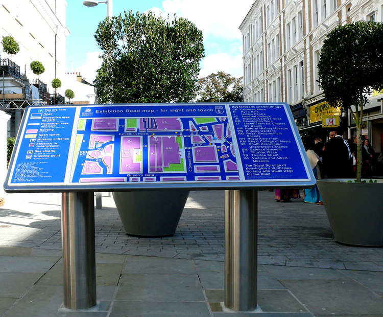
Image description: Image depicts the robust three-dimensional tactile map featuring colour-coding, raised letters, symbols and braille. The raised letters and braille are depicted in grey colour, the park and open spaces are depicted in green colour, the buildings in purple, the roads in dark blue and bus stops are marked with round yellow symbols. The map is installed on specially designed lectern style stands.
Tactile images, maps and touch installations enhance the experiences that people with sight difficulties have, making their visit more engaging, informative and stimulating, allowing greater independence and inclusion. – RNIB Tactile Maps and Maps 2015 Brochure
THE COMMISSION
The Royal Borough of Kensington and Chelsea (RBKC), working with Guide Dogs for the Blind and the Royal National Institute of Blind People (RNIB), and designed by Topografik, produced these robust three-dimensional maps featuring colour-coding, raised letters, symbols and braille. The raised letters and braille are depicted in grey colour, the park and open spaces are depicted in green colour, the buildings in purple, the roads in dark blue and bus stops are marked with round yellow symbols.
The story with the tactile maps in Kensington started with the Exhibition Road project. One of the things RBKC agreed with Guide Dogs for the Blind was to provide some form of wayfinding for blind and partially sighted people to get around the Exhibition Road area.
Most maps are designed and produced for a more utilitarian purpose. Maps represent something, often a portion of the real environment or a collection of data or ideas within that environment. The map user often must interpret qualitative and quantitative data represented on the map as well as the symbology that is actually representing those data. This sounds relatively straightforward, but map reading is a complex task, one that requires the reader to interpret the meaning of symbols and then understand the spatial distribution of those symbols. Sometimes the spatial distribution focuses on tangible features such as a street network and other times the spatial distribution focuses on intangible phenomenon such as population density. – Journal of Blindness and Innovation Research. Vol 5, No 1 (2015)
The mapmaker understands the data to be represented and then chooses the most appropriate mapping method. One of the goals of cartography production is to make the map use as efficient and effective as possible.
Tactile maps contain meaning that must be deciphered and transformed by the map user and if the same feature (a symbol representing water, for example) differs from tactile map to tactile map, then every time a tactile map reader uses a new tactile map, they will have to spend time studying and comparing the map key to the map itself, rather than attending to the geography in the map. On examining both Kensington maps we agree that they are really both effective, informative and immensely valuable.
THE EXHIBITION ROAD MAP
Many people including colleagues in Cultural and Heritage institutions assumed that the tactile map projects were initiated by Transport For London (TFL) because they are located in the stations. That is unfortunately not the case.
The Exhibition Road Map was commissioned by Shirley Long, on behalf of Kensington and Chelsea. Mrs Long is a Special Projects Consultant for Royal Borough of Kensington and Chelsea (RBKC). Our understanding is that London Underground do not want to instal any more of the tactile maps, which we feel is really unfortunate. But I am reliably told that does not mean Kensington and Chelsea will not find locations outside of the stations.
We started looking at the RNIB “Maps for All” which is a layered coloured plastic map recognised as a standard wayfinding tool, but a “Map for All” would not withstand outside use so RNIB recommended a metal sculptor who had worked with them on other projects. – Loz Simpson, Topografik
RBKC set up a small working group including RNIB, Guide Dogs, blind and VI users and together produced a map everyone was happy with. It is a multi-layered etched zinc map with coloured areas, large raised lettering and Braille. It was the first of its kind. It sits on its own specially designed lectern style stand outside South Kensington station. RBKC took advice about the height and angle of the stand from RNIB and mobility groups.

Image description: This Image depicts a close-up view of the tactile map, looking at it from the top left side. There is a guide dog to the right with the dog handler wearing a blue Guide Dogs tee shirt, with the handler’s right hand feeling the map by using his palm. We can clearly see the raised letters, symbols and braille on the map.

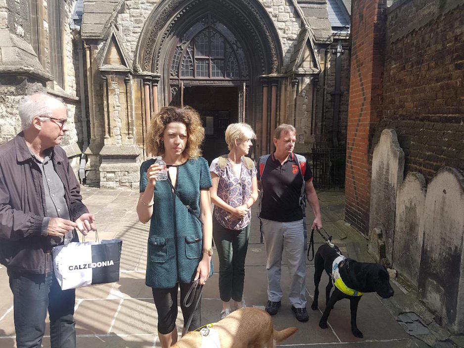
Image description: This Image depicts a group of visually impaired people, RNIB and Guide Dogs volunteers and staff standing around the Exhibition road tactile map for a group photograph. They are all smiling. The guide dog is on the right of the picture and looking towards the camera.
THE KENSINGTON HIGH STREET MAP
The Kensington High Street map is actually in High Street Kensington station and was installed in March 2018. Unfortunately, the map had to be mounted on a wall and tucked away in the corner inside the station because of space constraints. And because of this, it is difficult to spot and many people do not find it as accessible as they would have liked.
Just like the tactile map on Exhibition Road, this tactile map of Kensington High Street, for sight and touch, uses colour-coding, raised letters, symbols and braille to identify buildings, roads, open spaces and bus stops along Kensington High Street.
I was actually really concerned that the location of the tactile map at the High Street Kensington Station was known to only a few London underground users, and many regular VI station users were surprised to be told of its existence at our Sensory Trail of Kensington in August 2018.
Another observation was that the area was not well-lit meaning a VI person with some vision will also struggle to read and use the map visually. I brought these to the attention of Mrs Long, the project consultant.
I agree with your observations about the location of the Kensington High Street map. It is far from ideal but we were very restricted by London Underground who had the final decision on the location. Originally, we intended to put the tactile map on the pavement outside High Street Kensington station but the heavy footfall in the area coupled with a narrow pavement prevented this. This is why it had to be mounted on the wall. – Shirley Long, Special Projects Consultant, The Royal Borough of Kensington and Chelsea.

Other than those observations, all our VI participants felt this tactile map will help visually impaired users, including those with guide dogs, wheelchair users and other visitors, to map their way around Kensington High Street. They all felt the symbols and colours worked very well and that there was a good consistency in what they understood to be universal design practice and requirements.

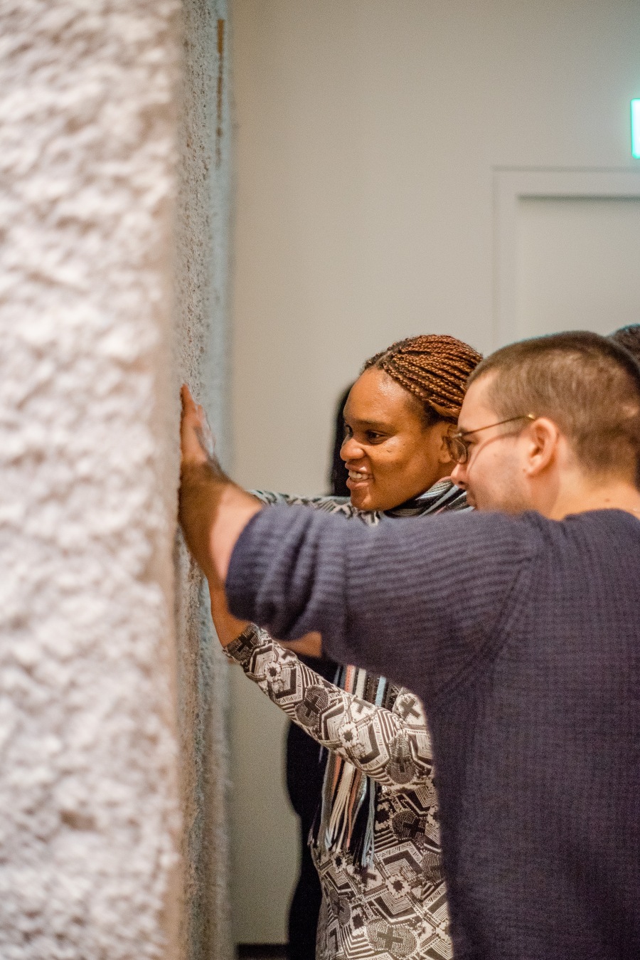
Image description: The image depicts a visually impaired person touching the tactile map with his right hand. He is touching and feeling the raised letters that read Open Space.
We believe that the tactile maps project is a really wonderful project. The maps are informative, relevant and valuable, and can potentially change the experience of VI commuters and the way people use outdoor spaces.
The tactile maps enhance the experience of VI users and can be used as a signpost, a point of orientation and landmark. They are more than just another wayfinding tool, they are an engaging source of information and independence. – Andrew Mashigo
More investment needs to be put into creating more tactile maps so we can have them installed in many prominent locations around the city of London. On my travels to Exhibition road, I have seen the map engaging and being used by sighted travellers, a sign of their value across the community as a whole.
CREDITS
We want to extend our sincere gratitude to the Royal Borough of Kensington and Chelsea and Topografik for their support in providing information and images for this article. We also like to personally thank Loz Simpson of Topografik and Shirley Long, Special Projects Consultant, RBKC, for all of their assistance.
Image Credits:
Royal National Institute Of Blind People (RNIB)